This article will review how to use cross-plots effectively within the Danomics Petrophysics Insights platform. Specifically we will review how to select formations, set filters, set colors, and set the scales. We will also explore how to use the equation playground to help us make custom cross-plots.
To access cross-plots within Danomics, simply go to the Crossplot tab. If you do not see one, left click on the 3 horizontal bars in the top left of any window, and select Add Tab >> Crossplot.
Built-in Cross-plots with parameters
There are a few built-in cross-plots available, such as the Neutron-Density cross-plot, which are pre-defined for the user.
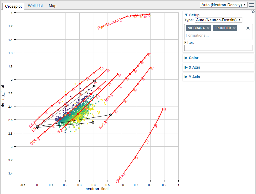
In the cross-plot shown above there are overlays (red lines and labels), parameters (grey circles connected via thin black lines), and the data points (colored using a yellow-purple color palette) for the Niobrara and Frontier formations. In these plots you can drag and drop parameters, filter data, and change the color scheme of the data points, but you can’t change the scales or remove the overlays (unless you edit the CPI Config).
Filter Expressions
To filter the data, you will need to type an expression into the box. Expressions can take many forms, but some common examples are given in the table below:
| Example Filter Expression | Description |
| @vwcl <= 0.35 | Show only data where the Vclay (@vwcl) curve is less than or equal to 0.35. |
| @vwcl < 0.35 && @phie > 0.05. | Show only data where the Vclay curve is less than 0.35 AND the Effective Porosity (@phie) is > 0.05. |
| !@badhole && @vwcl < 0.35 && @phie > 0.05 | Show only data where the badhole flag (@badhole) is NOT equal to one AND Vclay is less than 0.35 and Effective Porosity > 0.05. |
| @gross_res | Show only data where Gross Reservoir (@gross_res) is equal to one. |
| @gross_res == 1 | Same as above. |
| @vwcl < 0.35 || @gr_final <70 | Show only data where the Vclay is less than 0.35 OR the Gamma Ray (@gr_final) is less than 70. |
| (@vwcl < 0.35 || @gr_final <70) && (@phie > 0.05 || @son_porosity > 0.08) | Show only data where Vclay is less than 0.35 OR Gamm Ray is less than 70 AND where Effective Porosity is greater than 0.05 or Sonic Porosity (@son_porosity) is greater than 0.08. |
When using compound queries in which you mix and match AND (&&) and OR (||) operators it is recommended that you use parentheses to group criteria. This makes it more explicit and helps prevent confusion. Without the parentheses above the last expression:
@vwcl < 0.35 || @gr_final <70 && @phie > 0.05 || @son_porosity > 0.08
Would evaluate to Vclay less than 0.35 OR where both Gamma Ray is less 70 and Effective Porosity is greater than 0.05 OR sonic porosity is greater than 0.08. The lack of parentheses changes the behavior dramatically. Hence, users are recommended to be as explicit as possible when grouping criteria and using both AND and OR expressions.
Setting Colors
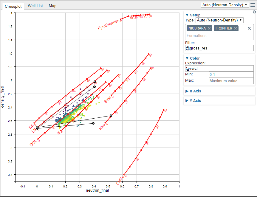
Colors are also determined by using an expression. In the example image above the data is filtered to only show data points where the gross reservoir criteria are met (@gross_res) and the data is colored by the Vclay curve (@vwcl). The range of color is set so the color scale starts at 0.1. It can go to whatever the actual data maximum is, since the Maximum value is not set.
A few examples are shown below:
| Color Expression | Description |
| @phie | Color by the Effective Porosity. |
| -@phie | Color by the Effective Porosity and flip the color scale. |
| @gross_res | Color by the gross reservoir. Note that this will only have two colors since the curve is either zero or one. |
| @phie^(1/3) | Color curve by the cube root of the Effective Porosity. |
Typically you will want to only color using just the curves (first 3 rows), but more exotic expressions are allowed, such as that given in the final row.
Using Cross-plots with Equation Playground
At present Danomics only allows cross-plotting of curves that are associated with the active module (this is done to optimize compute speeds). However, there are certainly instances when you would like to plot data from any module against that of any other module… or perhaps against a curve that doesn’t exist in any of the modules. To do this, we recommend using the equation playground in conjunction with cross-plots. We will provide a few examples below.
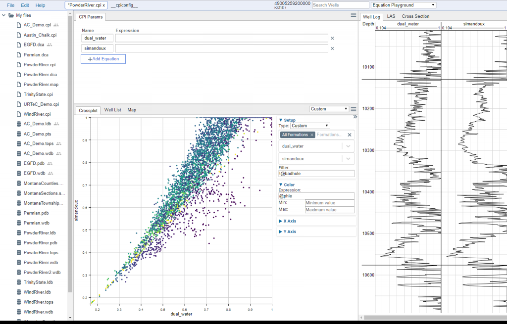
In the example above we have the equation playground module active, and have typed in just the curve names (dual_water and simandoux). This makes those two curves appear in the log track and available for cross-plots.
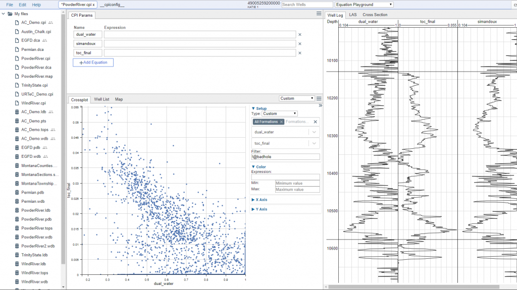
In the example above I have now added the toc_final curve and have cross-plot it against the dual water curve.
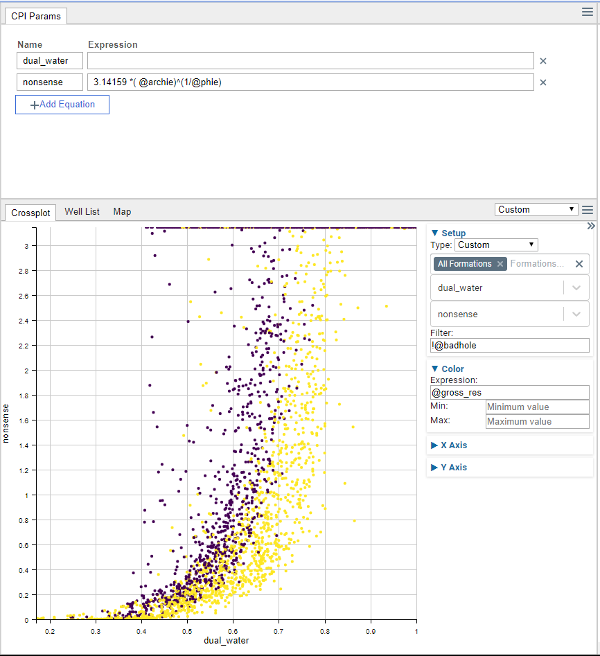
In this final example, I have cross-plot the dual water values against some nonsense values generated via a manually entered equation. These data are colored by the gross reservoir flag, and badhole values not included.